Customize Hotspots & Tooltips (CSS)
With a little extra CSS, you can enhance your Tooltips and Hotspots on top of the customization in our basic style editor (located on your Themes page).

Written by Sofia Domingues
Updated at May 14th, 2025
If you are looking for CSS for Modals & Slideouts, please go to Customizing Modals & Slideouts.
Copy, paste, and edit the snippets below to take your Flows to another level, but do not use body or html tags in the HTML component while building your Flows as it may cause your Flow to break or not show when the Flow has been pushed live.
Note: Our markup is subject to change. While we test our own styling operators across browser versions, we are unable to guarantee that your custom CSS will operate as expected.
Step Level Use?
The below snippets are formatted for use in the CSS section of the Theme that you'll be applying to your Flow. However, if you'd like to use any of these snippets to style a particular step (such that other steps aren't affected), wrap any of the below snippets in <style> </style> tags and place them in the HTML component of the step you'd like to modify. For example:
<style> /* Insert snippet below for step level use =) */
</style>
Adding styling to a step using the HTML block:

Hotspot & Tooltip CSS Selectors
Content Box
You can edit the content inside a Hotspot or Tooltip with this class:
.tooltip .panel-content
Adjusting Width
You can adjust the default width of Hotspots and Tooltips to make them larger or smaller using the following code.
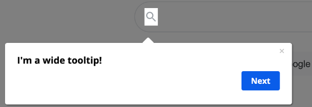
NOTE: If you make a Tooltip too wide it may look cut off in the Builder. This is due to the iframe size of the Builder. The Tooltip will NOT be cut off when viewing the live Flow.
.tooltip, .tooltip .panel {
    width:  400px;
    min-width: 400px;
    max-width: 400px;
}
Adding Borders
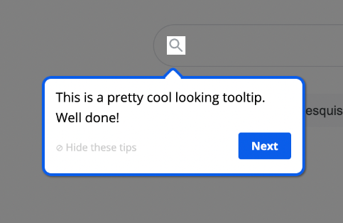
 .panel {
    border:3px solid;
    border-color: #0C5DE9 !important; /* Select the color of your choice */
    padding: 10px;
}

.panel.panel-default {
    border-radius: 10px;
}

.panel .panel-content {
    padding: 0px;
}

.tooltip .content .panel:after {
    box-shadow: 0 0 0 3px #0C5DE9; /* should be same color as above */
}
Adjust Opacity
If you'd like to make your Tooltips and Hotspots transparent, you can adjust the opacity value (on a scale of 0 - 1 in increments of .1).
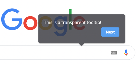
/* Change the opacity of the rectangular part of Tooltips/Hotspots */
.tooltip .content .panel {
  opacity: .8;
}

/* Change the opacity of the Tooltip/Hotspot pointer */
.tooltip .content.content-bottom .panel:before, .tooltip .content.content-bottom .panel:after {
  opacity: .9;
  box-shadow: none;
}
Adjust “Hide these tips”
You can modify the font that allows users to dismiss a Tooltip by adding the below snippet to the Themes section in your dashboard.
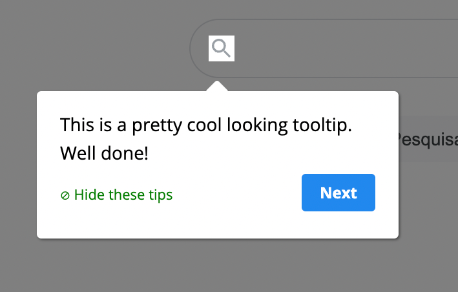
 .tooltip .panel .appcues-skip {
    color: green;
}
Changing the language of "Hide these tips" at the Theme level
You can modify the text of 'Hide these tips' within each Tooltip/Hotspot simply by clicking on the text and editing. However, if you'd like to change this on the Theme level so it applies to all of your Tooltips, perhaps to change the language, use the following CSS. Place the text you'd like to see in the step next to 'content'.
.panel .panel-content-actions .appcues-skip {
    font-size: 0;
}
.panel .panel-content-actions .appcues-skip:before {
    content: "× Cacher l'aide"; /* Add text wrapped in quotation marks */
    font-size: 11px;
}ProTip: You will want to make sure you name the Theme accordingly. For instance: 'Appcues Onboarding Theme: Spanish'.
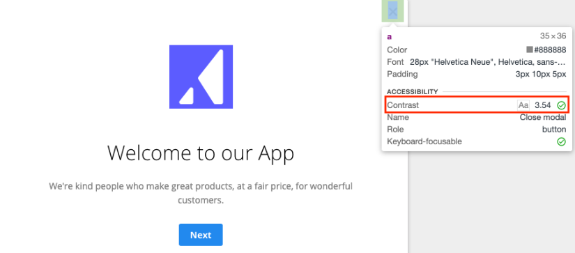
Modify the Close 'x'
You can modify the color of the Close 'x' to better contrast with your application. Feel free to modify the color below. Hex codes will work well too!
.exit-tooltip-container .exit-tooltip{
    color: orange;
    opacity: 1;
}
Accessibility Tip: You can check the contrast ratio of your button using the Chrome DevTools. To do this, open your Flow in the Appcues Builder, open the Chrome DevTools (Menu → More Tools → Developer Tools), Click the Inspect icon in the top-left corner of DevTools, and move your mouse pointer over the Close 'x'. Accessibility requirements suggest a contrast of at least 4.5.
Styling Tooltip Pointer/Arrow
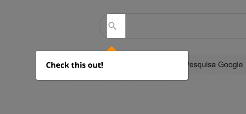
/* Change the color of the pointer */
.tooltip .content .panel:before, .tooltip .content .panel:after {
 z-index: -5;
background-color: #FC8C036;
}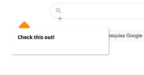
/* Adjust size and position of the pointer */
.tooltip .content .panel:before, .tooltip .content .panel:after {
 z-index: -5;
width: 22px;
height: 22px;
margin-top: -10px !important;
left: 32px !important;
}
Client-Side Custom CSS
These are CSS suggestions for updating CSS in your application. All of these suggestions will need to be implemented by your developers and will need to be added to the style sheets in your application.
Customizing the Hotspot beacon
While we'd love to make the Hotspot beacon available as a customizable setting in the Appcues UI, it's not currently available. However, if you're committed, you can modify the Hotspot beacon style, using CSS in your application's code. The following is an example of how you might do that.
/* Hide the original Appcues beacon */
appcues-layer svg.beacon {
  display: none;
}

/* Replace it with styles on the .beacon-container */
appcues-layer .beacon-container {
  background: orangered; /* Or your background image here, such as "url(http://yourdomain.com/path/to/your/image.png);" */
  border-radius: 24px;
  display: block;
  height: 24px;
  width: 24px;
  cursor: pointer;
}

/* Define a hover style */
.beacon-container:hover {
  background: dodgerblue;
}
Note: If you need some quick icons try using Font Awesome, Material Icons, or Linearicons.
More CSS Magic 🪄
Remove Tooltip pointer/arrow
.tooltip .content .panel:before, .tooltip .content .panel:after {
	display: none;
}
Cover the background with an image
.tooltip .panel {
  background-image: url("https://cdn.pixabay.com/photo/2020/04/18/01/04/cityscape-5057263_1280.png");
  background-size: 100%;
  background-position-y: 33%;
  background-repeat: no-repeat;
}
Two-column Tooltip
The following code allows you to change the size of the left column of a Tooltip.
.panel div.row > div:first-child {
   width: 33%;
   flex: none !important;
}